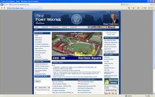
The www.cityoffortwayne.orghas been revised. While looking a bit more elegant, one glaring problem is on the front page. The Harrison Square graphic used is extremely outdated. This was the very first concept plan when the project was first unveiled to the public back in December 2006. This plan looks nothing like the current incarnation. In fact, the media is finally starting to use the current site plan rather than this obsolete relic. I hope Mayor Henry and his PIO’s have a better grasp on the project than this! I have a feeling they do, but come on guys!Â
- Home
- AFW Originals
- Downtown
- Elections
- Government
- Public Safety
- Public Safety Incident Reports
- Public Safety Incident Report Maps Index
- 2025 Allen County Indiana Homicides
- 2025 Allen County Sheriff’s Department Incident Reports Map
- 2025 Fort Wayne Fire Department Incident Reports Map
- 2025 Fort Wayne Police Department Incident Reports Map
- Allen County Indiana Homicides Index
- Allen County Sheriff’s Department Incident Report Maps Index
- Combined Public Safety Agency Incident Report Maps
- Fort Wayne Fire Department Incident Report Maps Index
- Fort Wayne Police Department Incident Report Maps Index
- Public Safety News Releases
- Allen County Indiana Homicides Index
